Company Branding
You can personalize the Glean UI to match your company's branding by adjusting:
- The company name displayed throughout the UI
- Logo
- Primary brand color
You must be assigned the Admin or Super Admin roles to be able to customize the workspace appearance.
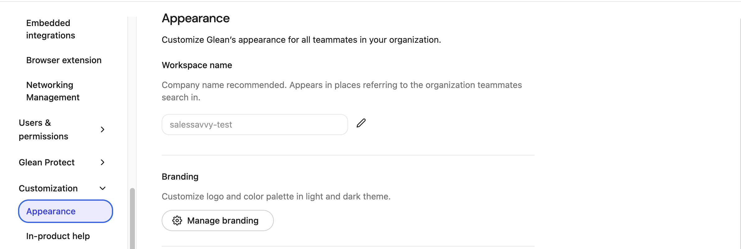
Workspace Name
The Workspace name appears throughout the Glean UI and in placeholder text. For example, "Search for anything at company_name".
This will be set to the name of your company by default. If you require it to be changed, you can do so by navigating to Admin Console → Appearance, and changing the value of the Workspace name field.
We recommend setting this to a shorthand version of your company name, for example: "MCN" instead of "My Company Name LLC"
The workspace name is used throughout the Glean UI and should be set to a shorthand version of your company name
Branding Settings
The branding menu includes the customization settings that control the look and feel of the Glean UI. These settings apply to all users at your company.
To customize the logo and primary brand color, navigate to Admin Console → Appearance, then click the Manage branding button.
Logo
The logo replaces the Glean logo in the upper left-hand corner of the navigation sidebar. It must meet the following criteria:
- Square aspect ratio
- Transparent background
- PNG format
- Custom logos must be uploaded for both light mode and dark mode.
- If
fullWhiteLabelingis enabled, you can also upload a wordmark logo in SVG format with a recommended 3:1 aspect ratio.
Primary Brand Color
The primary brand color is a single color that Glean applies to the left navigation to bring your brand into the UI. Glean derives complementary tints from this color to keep the navigation readable and accessible.
Specifically, the primary brand color drives:
- The background of the left navigation, which uses a tint of the primary color
- The icon color of the selected navigation item, which uses the primary color directly
- The background of the selected navigation item, which uses a different tint of the primary color
You can set the primary brand color independently for the light and dark themes by toggling between them inside the Manage branding panel.
Use the theme toggle inside Manage branding to preview your changes in light and dark mode before publishing.